1. Explore data and develop model
📈 Analyze log data and develop a machine learning–based prediction model.
- Estimated time: 60 minutes
- Recommended OS: MacOS, Ubuntu
About this scenario
Using Notebook, one of the core components of Kubeflow, you will develop a machine learning model to predict hourly traffic based on load balancer log data. This tutorial walks you through data preprocessing, visualization, feature engineering, model training, and performance evaluation.
Key topics include:
- Organizing and visualizing log data on an hourly basis
- Performing feature engineering that reflects periodicity
- Exploring and evaluating ML models using Scikit-learn
- Saving the trained model for use in the serving phase
Before you start
1. Prepare Kubeflow environment
You must have a Kubeflow environment set up in advance. Refer to the prerequisites to make sure that a CPU-based node pool and PVC volumes are already created.
2. Launch Notebook instance
-
Go to the Kubeflow dashboard and select the Notebook menu on the left.
-
Click the [+ New Notebook] button and configure it as follows:
Item Setting Name kc-lb-pred-handson Notebook JupyterLab Image kc-kubeflow/jupyter-scipy:v1.8.0.py311.1a CPU / RAM 0.5 / 1 Workspace Volume (User-defined) Data Volumes (See table below) Affinity / Tolerations (CPU node pool) / None -
For data volumes, use the PVCs created during the prerequisites stage and set their Mount Path as shown below:
Item Setting 1 Setting 2 Setting 3 Type Kubernetes Volume Kubernetes Volume Kubernetes Volume Name dataset-pvc model-pvc artifact-pvc Mount path /home/jovyan/dataset /home/jovyan/models /home/jovyan/artifacts -
Once the Notebook is created, click the [Connect] button to access the JupyterLab environment.
Getting started
Step 1. Prepare log data
In this tutorial, you will build a model that predicts the number of log occurrences over time using load balancer logs. Instead of using raw log fields, the target variable is the aggregated log count per time unit.
NLB logs are collected every 30 minutes, with each log record written in a single line of JSON format.
Synthetic data will be used instead of real-world logs. Download the file from the link below and upload it to the /home/jovyan path in JupyterLab:
- Download dataset: nlb-raw.txt
Log data field structure
| Field | Description |
|---|---|
| project_id | Project ID |
| time | Timestamp of log generation |
| lb_id | Load balancer resource ID |
| listener_id | Listener ID |
| client_port | Client IP and port |
| destination_port | Destination IP and port |
| tls_cipher | OpenSSL-style cipher group |
| tls_protocol_version | TLS protocol version |
Step 2. Preprocess NLB data
-
Load the log file and aggregate the data into a DataFrame with counts per 30-minute interval.
Load and aggregate logsimport json
import pandas as pd # Import module for data preprocessing
file_path = '/home/jovyan/nlb-raw.txt' # NLB file path
raw_data = []
# Load NLB dataset
with open(file_path) as f:
for line in f: # Read each line of JSON-formatted text
data = json.loads(line) # Convert JSON string to Python dict
raw_data.append(data)
raw_df = pd.json_normalize(raw_data) # Convert key-value pairs into tabular format using pandas DataFrame -
Aggregate log counts by 30-minute intervals and structure as a time-based DataFrame.
Aggregate logs# Round timestamps to 30-minute intervals
log_time_sr = pd.to_datetime(raw_df['time'], format='%Y/%m/%d %H:%M:%S:%f').dt.floor('30min')
# Count logs per 30-minute interval and store as a dictionary
log_count_dict = log_time_sr.dt.floor('30min').value_counts(dropna=False).to_dict()
# Generate time range (30-minute intervals)
time_range = pd.date_range(start='2024-04-01', end='2024-05-01', freq='30min')
# Create DataFrame with timestamps and corresponding log counts
df = pd.DataFrame({'datetime': time_range})
df['count'] = df['datetime'].apply(lambda x: log_count_dict.get(x, 0)) -
Preview the result of log aggregation.
Preview resultdf.head(5)
Sample output
| datetime | count | |
|---|---|---|
| 0 | 2024-04-01 00:00:00 | 26 |
| 1 | 2024-04-01 00:30:00 | 29 |
| 2 | 2024-04-01 01:00:00 | 51 |
| 3 | 2024-04-01 01:30:00 | 32 |
| 4 | 2024-04-01 02:00:00 | 69 |
Step 3. Analyze NLB data
Visualize the log count data to identify basic traffic distribution patterns.
-
Import necessary modules and add time-related columns to the dataset.
Add time-related columnsimport matplotlib.pyplot as plt
df['week'] = df['datetime'].dt.isocalendar().week
df['dow'] = df['datetime'].dt.day_of_week
df['hour'] = df['datetime'].dt.hour -
Plot the log count changes over the entire period.
Time series of total log countsplt.figure(figsize=(15, 5))
plt.title('NLB Log Count')
plt.xlabel('Date')
plt.ylabel('Count')
plt.plot(df['datetime'], df['count'])
plt.show()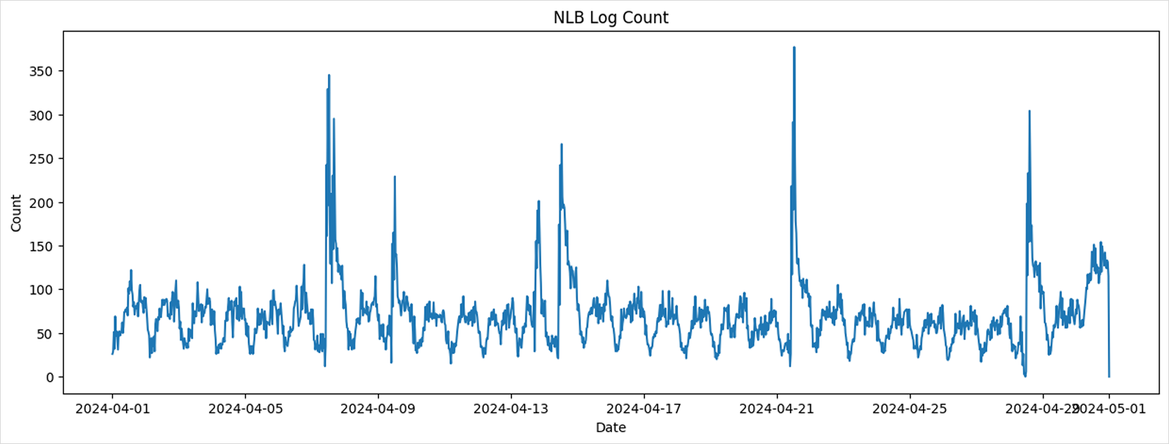
The chart reveals a periodic pattern in overall traffic volume.
-
Create a comparison plot to observe weekly trends in log volume.
Compare log counts by week over a 4-week span:
Weekly log trendsfig, axs = plt.subplots(2, 2, figsize=(20, 10))
fig.suptitle('Log Count by Week - 4 weeks')
for i in range(4):
axs[i//2][i%2].set_ylim(0, max(df['count']))
axs[i//2][i%2].plot(df[df['week'] == 14+i]['datetime'], df[df['week'] == 14+i]['count'])
axs[i//2][i%2].set_title(f'Week {1+i}')
plt.show()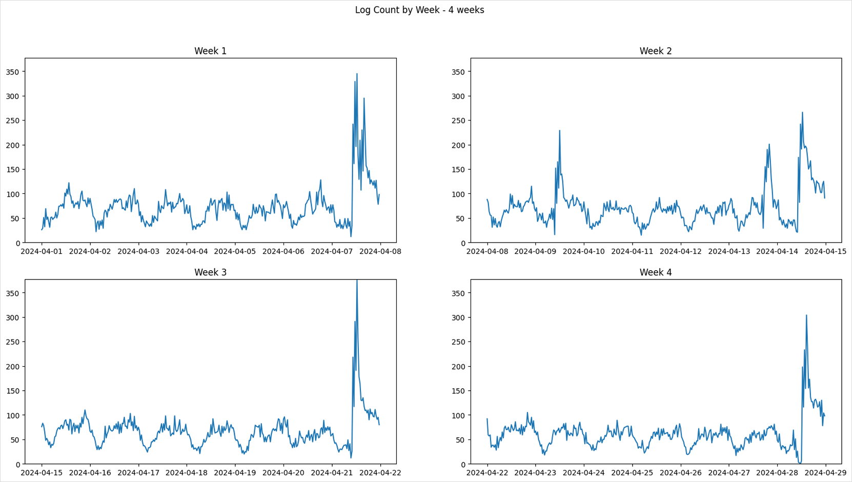
The log count graph shows repeating traffic patterns depending on the day of the week.
-
Visualize the distribution of log counts by hour and day of the week using heatmaps.
Hour-Day heatmapfig, axs = plt.subplots(2, 2, figsize=(15, 8))
fig.suptitle('Log Count Heatmap by Week')
for i in range(4):
week = i + 14
df_grouped = df[df['week'] == week].groupby(["hour", "dow"])["count"].sum().reset_index()
df_heatmap = df_grouped.pivot(index="dow", columns="hour", values="count")
axs[i//2][i%2].set_title(f'Week {i+1}')
axs[i//2][i%2].imshow(df_heatmap, cmap='hot', interpolation='nearest')
axs[i//2][i%2].set_xticks(range(24))
axs[i//2][i%2].set_xticklabels(range(24))
axs[i//2][i%2].set_yticks(range(7))
axs[i//2][i%2].set_yticklabels(['Mon', 'Tue', 'Wed', 'Thu', 'Fri', 'Sat', 'Sun'])
axs[i//2][i%2].set_xlabel('Hour')
axs[i//2][i%2].set_ylabel('DoW')
plt.show()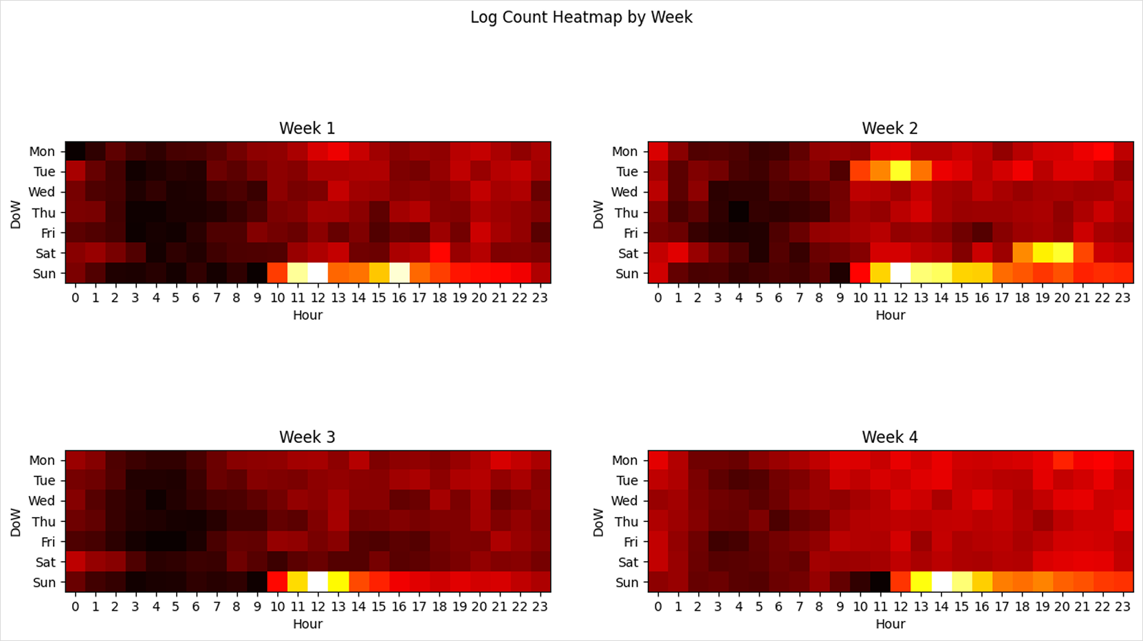
The heatmaps reveal concentrated traffic patterns on specific weekdays and times of day.
Step 4. Feature engineering
Log counts show a periodic pattern depending on the time of day and day of the week. Since 11 PM is followed by midnight, and Sunday is followed by Monday, these cyclical characteristics must be encoded in a way that the model can learn. To do so, we apply cyclic encoding to transform the time-related variables before training the machine learning model.
The hour and day-of-week values are cyclic by nature, so we use sine and cosine functions to encode their periodicity. Since the data is collected every 30 minutes, a full day is divided into 48 time intervals.
import numpy as np

time_sr = df['datetime'].apply(lambda x: x.hour * 2 + x.minute // 30)
dow_sr = df['datetime'].dt.dayofweek

dataset = pd.DataFrame()
dataset['datetime'] = df['datetime']  # for convenience in later steps

# Time-related features x1, x2
dataset['x1'] = np.sin(2*np.pi*time_sr/48)
dataset['x2'] = np.cos(2*np.pi*time_sr/48)
# Day-of-week features x3, x4
dataset['x3'] = np.sin(2*np.pi*dow_sr/7)
dataset['x4'] = np.cos(2*np.pi*dow_sr/7)

# Target variable (label)
dataset['y'] = df['count']

# Save dataset for later steps
dataset.to_csv('/home/jovyan/dataset/nlb-sample.csv', index=False)

dataset.head(5)
Sample of generated training dataset
| datetime | x1 | x2 | x3 | x4 | y | |
|---|---|---|---|---|---|---|
| 0 | 2024-04-01 00:00:00 | 0.000000 | 1.000000 | 0.0 | 1.0 | 26 |
| 1 | 2024-04-01 00:30:00 | 0.130526 | 0.991445 | 0.0 | 1.0 | 29 |
| 2 | 2024-04-01 01:00:00 | 0.258819 | 0.965926 | 0.0 | 1.0 | 51 |
| 3 | 2024-04-01 01:30:00 | 0.382683 | 0.923880 | 0.0 | 1.0 | 32 |
| 4 | 2024-04-01 02:00:00 | 0.500000 | 0.866025 | 0.0 | 1.0 | 69 |
As shown above, the dataset consists of 4 features:
- x1, x2: time (hour + minute) encoded using sine/cosine
- x3, x4: day of week encoded using sine/cosine
- y: number of logs at each timestamp
Step 5. Train, evaluate, and save ML model
-
Before training the model, the dataset is split into training and validation sets for evaluation purposes. In this tutorial, data up to week 16 as of April 21, 2024 is used for training, and data after April 22, 2024 is used for validation.
Splitting training and validation datatrain_df = dataset[dataset['datetime'].dt.isocalendar().week < 17]
test_df = dataset[dataset['datetime'].dt.isocalendar().week >= 17] -
To streamline performance analysis, a function is defined to both output evaluation scores and visualize the prediction results.
Model evaluation and prediction result visualizationfrom sklearn.metrics import mean_squared_error, mean_absolute_error, r2_score
def print_metrics(y, y_pred):
mse = mean_squared_error(y, y_pred)
mae = mean_absolute_error(y, y_pred)
r2 = r2_score(y, y_pred)
print(f"MSE: {mse:.4f}\nMAE: {mae:.4f}\nR2: {r2:.4f}")
def draw_predictions(test_df, predictions, model_name=None):
plt.figure(figsize=(20, 5))
if model_name:
plt.title(model_name)
plt.xlabel('Date')
plt.ylabel('Count')
plt.plot(test_df['datetime'], test_df['y'], label='Actual')
plt.plot(test_df['datetime'], predictions, label='Prediction')
plt.legend()
plt.show() -
We apply various machine learning models from Scikit-learn and compare their prediction accuracy. All models are trained using the same four input features (x1, x2, x3, x4). The resulting prediction graphs visually illustrate how closely each model’s predictions align with actual traffic.
Linear Regression
from sklearn.linear_model import LinearRegression

params = {
    # Refer to the model documentation when setting parameters
}
model = LinearRegression(**params)
model.fit(train_df[['x1', 'x2', 'x3', 'x4']], train_df['y'])
predictions = model.predict(test_df[['x1', 'x2', 'x3', 'x4']])
print_metrics(test_df['y'], predictions)
draw_predictions(test_df=test_df,
                predictions=predictions,
                model_name='Linear Regression')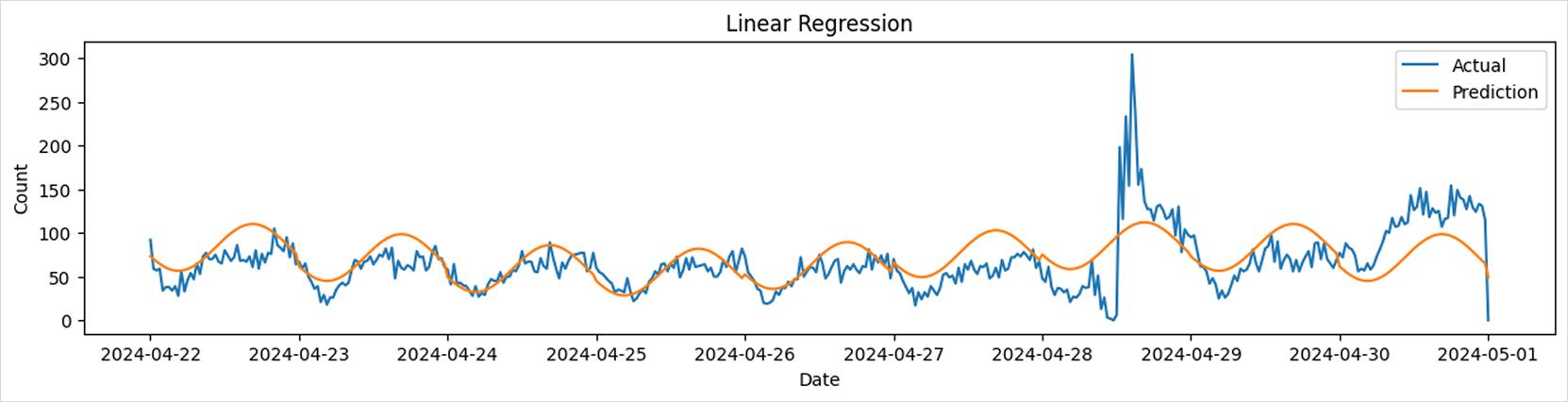
Gaussian Naive Bayes
from sklearn.naive_bayes import GaussianNB
params = {
    # Set parameters with reference to the model documentation
}
model = GaussianNB(**params)
model.fit(train_df[['x1', 'x2', 'x3', 'x4']], train_df['y'])
predictions = model.predict(test_df[['x1', 'x2', 'x3', 'x4']])
print_metrics(test_df['y'], predictions)
draw_predictions(test_df=test_df,
                predictions=predictions,
                model_name='Gaussian Naive Bayes')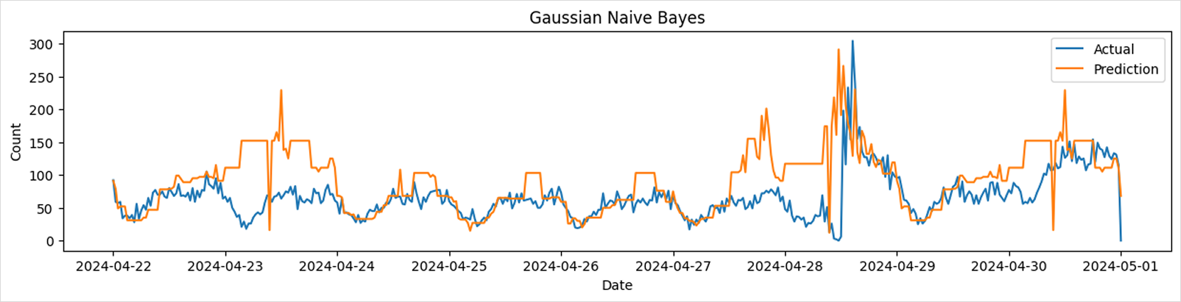
Random Forest Regressor
from sklearn.ensemble import RandomForestRegressor

params = {
    # Set parameters with reference to the model documentation
}
model = RandomForestRegressor(**params)
model.fit(train_df[['x1', 'x2', 'x3', 'x4']], train_df['y'])
predictions = model.predict(test_df[['x1', 'x2', 'x3', 'x4']])
print_metrics(test_df['y'], predictions)
draw_predictions(test_df=test_df,
                predictions=predictions,
                model_name='Random Forest')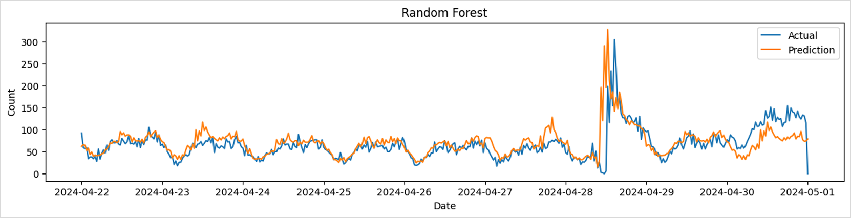
Gradient Boosting Regressor
from sklearn.ensemble import GradientBoostingRegressor
params = {
# Set parameters with reference to the model documentation
}
model = GradientBoostingRegressor(**params)
model.fit(train_df[['x1', 'x2', 'x3', 'x4']], train_df['y'])
predictions = model.predict(test_df[['x1', 'x2', 'x3', 'x4']])
print_metrics(test_df['y'], predictions)
draw_predictions(test_df=test_df,
predictions=predictions,
model_name='Gradient Boosting')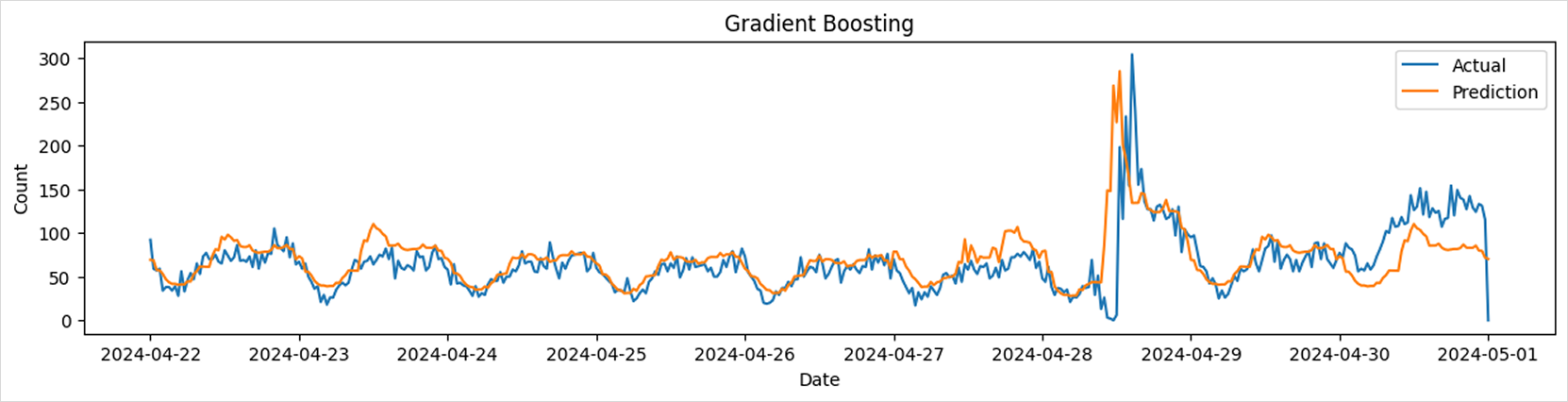 tip
tipFor details on the models used in this tutorial, refer to the following link.
- Linear Regression: link
- Gaussian Naive Bayes: link
- Random Forest: link
- Gradient Boosting: link
- In addition, you can explore various models and hyperparameters by referring to the official Scikit-learn documentation.
-
The trained model is saved as a file using the joblib library.
-
Since the saved model file will be used in the upcoming model deployment tutorial, it is stored in the mounted model-pvc volume at the path
/home/jovyan/models.Save modelimport os
import joblib
model_dir = '/home/jovyan/models/lb-predictor'
os.makedirs(model_dir,exist_ok=True)
model_path = os.path.join(model_dir, 'model.joblib')
joblib.dump(model, model_path) # Save model
# model = joblib.load(model_path) # Load model